Fucking really? When they fired huge percentage of the kitchen staff and ruined service, when they switched the suppliers to cheaper and mostly pre prepared ingredients, when they cut potion sizes and jacked prices. That was fine, no problem… but, they changed the logo… slightly? DISASTOR!
Like, this really is what I find absurd. That people are so willing to let their discontent be redirected to symbology, rather than question systems making things materially worse.
As insignificant as a mid quality restaurant chain is, it just seems emblematic.
As insignificant as a mid quality restaurant chain is, it just seems emblematic
Because it’s a perfect representation of their cult behavior. Brainwashed into only caring about surface level snapshots of issues instead of actual material details.
That said, new logo is actually trash compared to the original. Can we please just let this trend of minimalist corpo slop die already!?
Honestly, If they changed the logos of things but did’t gut the quality… it would really not matter.
Oh yeah, fair.
I just personally hate that all major business logos now seem to just be the name on a single color background. I miss when logos had personality.
I really think they’re finding the last corners they can cut for profit, meager as it may be. Less colors, less details, less $ to print. That’s my theory at least. Another good example of what you’re talking about is the Pringles guy:

Edit: Dunkin Donuts is another one, come to think of it. I swear they’re going to pull a Prince one day and have their name become a single emoji/symbol or something. They managed to squeeze all the way down from Dunkin’ Donuts to Dunkin’ to DD… I’m convinced they’re going to be the first major company to be named a symbol and people will call it DD or maybe they’ll even come up with a new sound that will represent their symbol, and you’ll have to get their app to make the sound 🫠
D
I already call it DD when I cave to needing a quick coffee when I’m running late.
A lot of folks lack curiosity.
When they fired huge percentage of the kitchen staff and ruined service,
They fired Brad’s wife
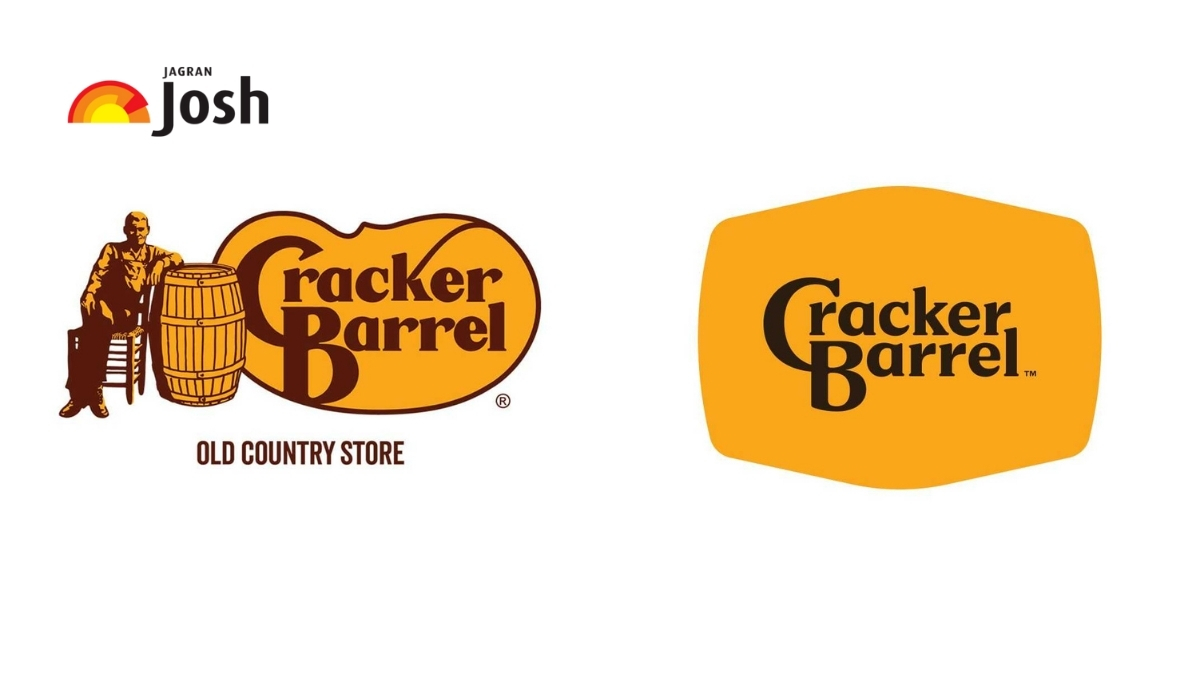
Here’s a logo comparison of old to be, because the article didn’t for it for some reason:
Definitely worse, no doubt about it.
It’s a lot simpler
More generic
Yep. Generic is exactly how I’d describe it too.
It looks MORE like it’s from the 70’s.
Maybe that’s the goal. Is Dennys still around. This reminds me of their logos general shape, but melted.
I like it the direction, but the topography needs adjustments. Full disclosure I’m also a design snob with a fucking BFA who got stuck coding shit for the last 20 years.
I mean like the UV brittled plastic retro microwaved steak & potatoes with a sprinkle of asbestos variety of looking like the 70’s. Not the nostalgia kind. It’s a vibe and i guess it fits the restaurant.
The personality got sucked out, and all that was left is a indistinct husk.
To be fair it’s tasted that way for far longer than they’ve been remodeling
So it fits their food. That’s great advertising.
Looks like a belt buckle for a cowboy
Older is nicer. Why must one ruin logos like this.

I oppose this logo change not for a political reason or anything of that ilk, but only because it’s yet another senseless and uninspired simplification of a brand that eliminates the distinctiveness of its silhouette and turns it into another bland and uninspired sponge cake with no flavor. Say what you like about Cracker Barrel and their food (and I’m sure many will), but at least when you saw one of their signs on a pole from the interstate you knew damn well what it was.
Compare it now to the Denny’s logo:

Bojangles:

Or Golden Corral:

Etc.
Wow, some text in a yellow ovoid diamondy blob. How original. No iconography whatsoever. It’s barely even a wordmark. I wonder how much some asshole got paid to come up with this and how I can get in on that game.
They got rid of the cracker and the barrel
I’d award you a gold star if there were such a thing. Upvote will just have to do.
We have the Winner Of The Thread!
There’s a reason they are choosing simplicity over ornate/complicated logos. Printing, embroidering, sign making. All of these are much easier and cheaper to do with simpler logos. It’s always about money.
I’d doubt that’s it. Practically everything is digitally printed these days, so the complexity really doesn’t matter. In some specific processes the number of colors used may be a factor, but the original design was already only two colors to begin with (or three if you count the transparent bits). The shape would matter if they were trying to make illuminated signage with the same outline as the logo which Cracker Barrel already don’t do. Their pole signs at present are just rectangular with rounded corners to begin with. I’ll grant there may be a minor complexity advantage to having machine embroidery done of it, but the last time I was in one of their restaurants their employees all had logo and name tag pins and their uniform shirts were sans logos, so that’s a moot point anyhow.
I’ll certainly concede that some C-suite idiot may think this is going to save them on uniform and printing costs but in reality it actually won’t. If that’s why they really did it they’re even dumber than we’re giving them credit for. (And another commenter below pointed out that rebrands cost money to pull off. Not just whatever seven figure consultancy fee you just paid to some twerp with a Macbook to render your logo unreadable, but also all the materials and signage you then have to get made, printed, have somebody install.)
Herewith I will prattle on about the topic because Design Is My Passion (well, okay, at least part of my job) and this whole trend obviously honks me off and I’m starting to feel like the only sane man left standing.
The rationale for dumbshit logo oversimplification I usually see bandied about is “increasing brand recognition,” with the notion that a simpler logo is more readily and quickly recognizable. This has a kernel of truth to it, however only those with the pointiest of spectacles with the beadiest of chains know the secret. And that is mostly what drives this is the logo’s silhouette, not the words inside it. (And to a lesser extent, its colors. But tell that to all the fast food chains who insist on using red and yellow for their branding, so that’s already on the way out.) This is especially so if the logo will be seen only briefly or at a distance, for purest sake of example and for no particular reason at all, let’s say at the top of a pole next to an interstate highway 200 yards away while hurtling past at 75+ MPH.
People don’t read. Even so, a large portion of them probably don’t have great eyesight. If your logo is going to be a wordmark, it had better have its own very distinct silhouette, and preferably it ought to be short. The frillier and less sans-serify you make it the less likely anyone is to be to comprehend it, let alone bother to process it. If your design vision absolutely cannot accommodate that for whatever reason, its surrounding geometry had better have a recognizable silhouette. And for fuck’s sake, make sure it’s high contrast against whatever’s inside it.
I’ll throw out some examples. Here are four brands who, apart from any other shortcomings and even after going through various rounds of logo simplification, still get it:

I’ve brutally reduced these to only their silhouettes and in the case of any that also included wordmarks and haven’t already removed them from their official logo, I’ve also stripped them of these.
I’ll bet you can name three out of four of those without even thinking about it, and third from the left will only slow down some people for a second or two.
(This is also why so many traffic signs are shaped such as they are, and the important ones don’t share shapes, and also why it feels so unnervingly wrong in a Mandela effect kind of way when you visit a country whose highway authority hasn’t quite figured that out.)
Meanwhile, here’s a lineup of a few who fail the test:
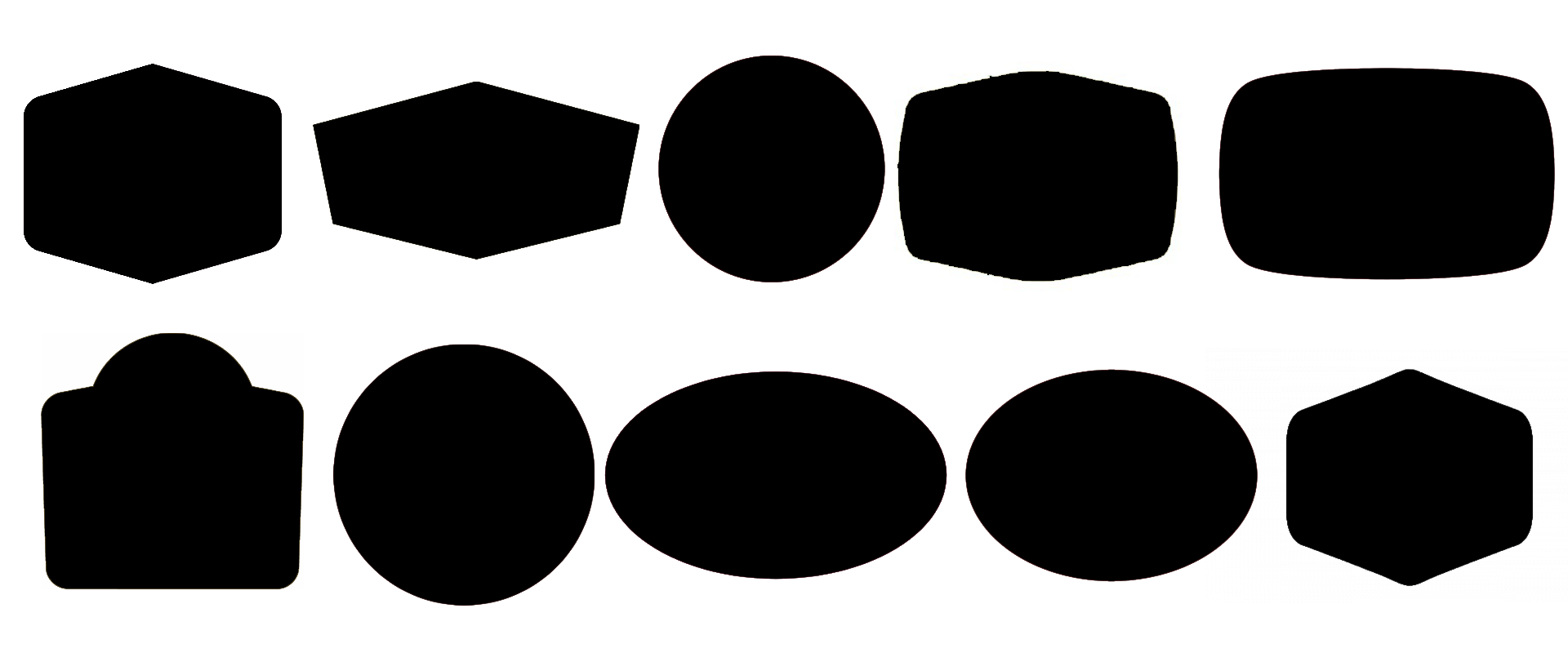
Yes, I deliberately cherry-picked these to form a lineup of options that all suck. But in my defense, there are ever so many to choose from. Go on, whose are those? No cheating and using Google image search to try to match up the minutiae of the aspect ratios. You have to do this right off the top of your head. Remember, these are flying by on an interstate sign.
It’s the same deal with app icons, which these days all seem to be devolving into “some circular swirly thing, possibly multicolored, that doesn’t tell you anything about what our app does.” It’s even worse now that everyone’s launchers seem to want to automatically badger any icons that still do manage to have a recognizable silhouette into solid colored circular backgrounds.
This is a good post. I wanted to add that the “saving money” aspect of changing the logo also ends up falling flatter when you consider how much existing branding have be changed. That doesn’t happen for free.
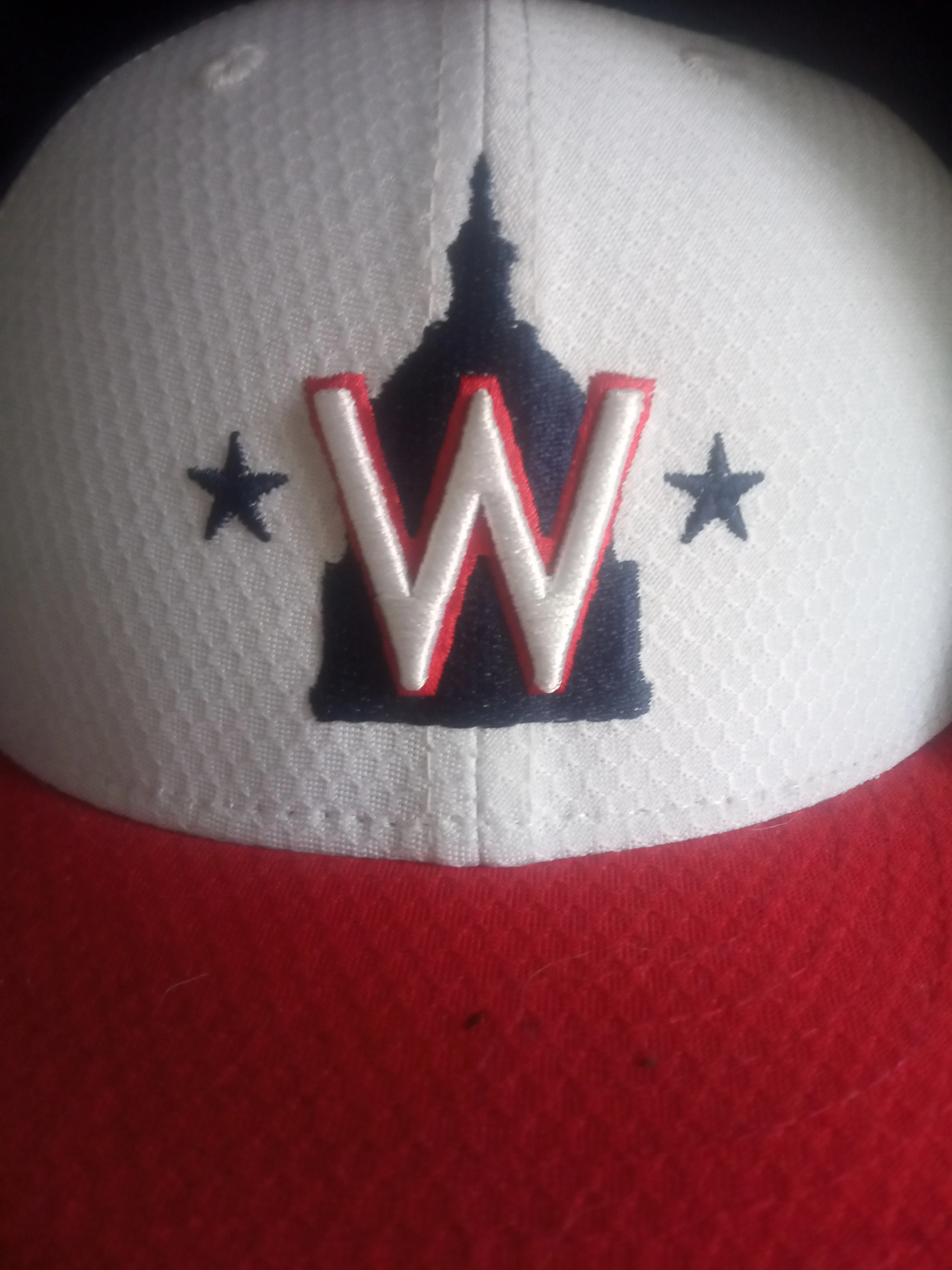
So what’s the star logo? I imagine it’s just something we don’t have in Alberta, else I’d recognize it too
Hardees/Carl’s Jr. (The very same “brought to you by…” from Idiocracy!)
While we’re at it, here’s the key for my second round of blacked out logos which ought to be far enough down the comment chain to not instantly spoil it for anyone puzzling over them:

Hands up everyone who thought the one on the bottom left was Wendy’s? Yeah, good try.
Omg I thought these were supposed to be street signs not restaurants
I thought the bottom left one was Del taco. Which I’ve only eaten at once lol.
Fortunately Del Taco have kept themselves off of my naughty list thanks to their highly recognizable sawblade sun logo, which they even managed to retain in their most recent rebranding. Ditto with Taco Time and their cactus.
Thats funny, I had the craziest feeling that it was a random taco place in Tuscaloosa that I’ve never seen anywhere else. What are the odds? Lol
*✋
Hardee’s
Oh god, Google made all of their logos for all of their android apps four color rainbow vomit, and when you’ve grouped them all into a folder, picking out the Play store is now a chore.
I was going to mention the Google app icons in response to their comment, so I’m glad I’m not the only one. If you have a page full of these, finding the right one for what you need takes an extra second or two of actual brainpower:


It fundamentally misunderstands the way that the apps fit into peoples’ daily lives. People use the apps for what they do, not for what brand they are. When I go looking for a map app, I’m not looking for a brand of app; I’m just trying to get directions. And the app logos misunderstand this, by putting the brand first and the function last.
The sheer number of them as well; Meet, Chat and Voice. Pixel Buds and Wear OS. I don’t even know what Google One is.
So many of the glyphs are so abstract that they just don’t help. Like, what is that Podcast logo even supposed to look like?
Thanks for the hindsight that’s very interesting!
Heaven forbid we have both versions of the logo.
Having 2 logos as a brand is not good. You want one recognizable and prominent standard logo.
If the guy on the barrel is just instantly recognizable as the name using a specific font, than you can have both.
Removed by mod
Tell that to all the brands who have both a logo and a mascot, especially those whose mascot does not appear as part of the logo or only selectively appears alongside it. Geico, Progressive, Pillsbury, Planters, M&Ms, Ronald before he was discontinued, etc. And somehow Adidas has like four logos (all with recognizable silhouettes and with good use of negative space!) and they haven’t tanked yet.
None. I grew up surrounded by mascots.
I know of a lot of businesses that have kind of a logo system.
Take McDonald’s. They’ve done various combinations of the word McDonald’s, the golden arches, and the colors red, yellow and white, and while yes there have been refreshes of the brand and styles have come and gone over the years, several were in use at any given time depending on the context they were displayed in. You might have the full logo up on the pole sign and just the arches on a red background on the side of the building.
I could imagine Cracker Barrel separating that logo into two parts, the man-chair-barrel diorama, and the kidney shape with the text in it, and using one, the other or both in various circumstances. Like, imagine they made to-go cups, could you imagine trying to emboss the full logo into PET?
At least put the brown border around it back. It looks so plain.
Anything to take their focus away from the Epstein files.
Tell them the guy on the logo is lgbtq, then they’ll be thrilled with the change.
they will lose thier minds.
probably this, and TRUMPs hand and ankle issues.
Republicans really love cancel culture I guess 🤣 🤣 🤣
Finally a bipartisan agreement that the new logo sucks
I think that the idea of simplifying a logo is fine, but this drops a lot of the feel.
and the feel of cracker barrel is critical to the whole experience
Is it really agreement? Do you feel that the new logo sucks because it’s flat, uninspired, and anodyne? Or do you feel that the new logo sucks because it’s an attack by the evil, communist, socialist, libdem, woke, LGBTQ community to remove all white culture from American society?
Broken clocks are right twice a day.
Sometimes a calculator is a clock.
The nation is finally healing.
The day has finally come when we can embrace felon rapist pedophile supporters as our brothers and sisters.
They just keep getting weirder and weirder.
In case anyone was wondering if conservatism was a mental disorder.
Nah. They chose this. End them.
If they and Jaguar had changed their logos 15-20 (whenever the switch to minmalistic styles was) years ago, this shit wouldn’t even be news.
I think Jaguar getting rid of the Jaguar in their logo would have been mocked at any point in time.
That’s what I was thinking. And people have been criticizing flat designs for years now and MAGA is only now just noticing?
Sure it would have.
We complained about all kinds of trivial shit 15-20 years ago.
please talk about brands bro
its so important to constantly talk about and reinforce the existence of american brands bro
do you think they are woke or cringe?? hey what about their commercials??? talk about the brands
we all have to talk about american brands bro this is what real life is
They’re still mad about Cracker Barrel for ending segregated seating in 2004… after a lawsuit.
ok, so since we’re talking about the cracker barrel logo, can i ask the question i’ve always had about it?
what is the symbol/shape under the text? it’s like a bean with a pointy bit. is that just a style flourish? is it a silhouette of something foreign to my eye?
i’ve wondered this in isolation for years, but there was never enough interest in the cracker barrel logo for me to inquire about this until now.
Kidney bean
Maybe the side view of a saddle? It feels familiar but not sure.
Oh I thought it was supposed to evoke the bottom of a rocking chair, but idk actually.
I always assumed it was a lasso.
my money is on style-flourish as you’ve mentioned, but that pointy bit does seem out of place.
Just flourish, yeah. The rounding edge comes off the k wraps around, and at the end reverse curves upward as is popular in cursive and western calligraphy.
It’s a turd.
which is coincidentally what you’ll make after eating at cracker barrel…checkmate librulzz /s
specifically a constipation turd.

Nah. I’ll just go read the Daily Mail instead.
I bet they still redirect you to bullshit when you try to back out from the site.
Right wingers are idiots, in the sense of being exclusively emotional driven. Like children, without the excuse of being children
Imagine attaching your identity so much to a chain restaurant, then again, that’s all there are in most Right Wing areas in America.
they have a very short attention span, they attach to any thing new and shiny that comes along. which is why putting everyting in gold is so common with these people, or paying up the wazoo for a low quality item.