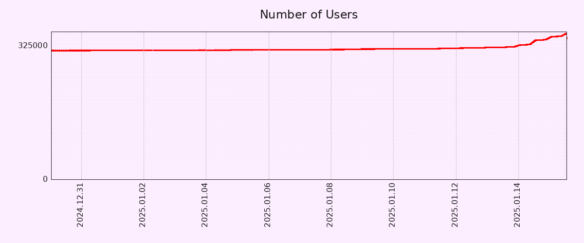
Editing to let people know that I will be blocking anyone who feels the need to tell me why this graph is inaccurate. I truly don’t care, but feel free to chime in with your useless take and land a spot on my block list! 🙂
Lies, damn lies, and graphs that don’t have the Y-axis starting at 0.
10% growth in a day is nice, but far from a revolution. Let’s see this trend going for a month.
Monthly active users increased by 43% between 13 and 14 January: https://pixelfed.fediverse.observer/dailystats
I don’t think anyone here is arguing that the entire world will be using pixelfed by the end of the year, and that its usage will expand to other galaxies by the end of the decade.
It’s a comment about the current growth curve, and it is both accurate and interesting.
Lemmy had the same jump in numbers during the Reddit Exodus. Mastodon had a huge boost when Elon bought Twitter.
Every spike has been a followed by a slide back to baseline in less than a couple of months. After you’ve seen it happen so many times, it is no longer interesting.
The fact that you believe these platforms were the same before and after these events makes it sound like you were not, in fact, there to see it happen. In my experience, it permanently changed both platforms, transforming them from weird niche sites to genuine alternatives.
That said, what you find interesting or not is not any of my business.
This thread (and others in that post) might interest you: https://communick.news/post/2320430/4138857
Yeah, I know I shouldn’t bother. I am just annoyed by the misconception that all graphs should always start in 0 on the Y axis, as if it was some law of nature. Shouldn’t allow myself to get dragged in further. :)
I am here since before the Reddit backout and I am on Mastodon since 2018. Lemmy was at 15k MAU, went up to over 125k and now is 1/3 of that. Mastodon had
1M575k something before Elon, hit up close to2M1.5M and now is sitting around 800k. (edit: I was looking at the overall charts and used wrong figures. Corrected now.)Sure, if your reference point is waaaay before the spikes then what we have now seem “a lot”. However, my point is that these spikes are far from being indicative of mass adoption.
Lemmy was at 15k MAU, went up to over 125k and now is 1/3 of that.
So it increased by 200%
Mastodon had 1M something before Elon, hit up close to 2M and now is sitting around 800k.
This stat is really surprising. Do you by any chance have a link where I can see this data?
I don’t think that either Mastodon or Lemmy slid back anywhere near as far as back to baseline? Sure, usage went down, perhaps even significantly compared to the peaks, but I think that both retained a lot more users than they had before their respective spikes. I’m an example of someone who came into Mastodon with the Twitter exodus and into Lemmy with the Reddit exodus, and I’ve stayed for both.
I don’t mean that the numbers went exactly back where they were. I mean that every spike was followed by a steady decline.
Compare it with Bluesky now, or compare it with Reddit during Digg’s meltdown. Their growth curves will look like an S-curve, not this series of discrete jumps followed by 40-60% loss.
@rglullis@communick.news tbh we shouldn’t expect the adoption curve of any Fediverse software to be somewhat similar to the ones of centralised social networks, since Fediverse completely misses the commercial aspect that encourage key users to stay in the platform easing communities to stick to it as well. My guess is that without the action of commercial dynamics, the situation wouldn’t be so different from the jumps-and-losses moments we’re used to
Got it, thanks.
Cool. You… don’t have to engage in discussions that bore you. Why waste your time?
the head dev Dan Sup mentioned the number of active users jumping from 6k to 30k. we’ll see how it holds, but there is strength in numbers, people only stay if other people see what they post there. i have good hopes and really want to ditch instagram
Normalized graph for you:

Not a vertical line, at all. For sure cool, but very exaggerated with a dishonest graph.
Wake me up in 2 months when 80% of new users churned.
I’ve never been on IG but I’m strongly considering a pFed account. Am I churn or am I miniscule net-new?
And yeah, it’s a hope that the rumoured meta toxicity is somehow magically not on pFed. I wanna see my nephew’s designs and art but not the influencerati junk I fear is on the captive platform.
The y axis starting zero does not change the fact that it’s exponentially growing right now. Filter that link posted below for 120 days and it is still a nearly straight vertical line of growth.
It’s not exponentially growing. At best, the growth rate has exponentially increased. These are VERY different things.
It was exponentially growing, the platform would come screeching to a halt and crash.
Wait what? The whole point of exponential growth is that all it’s derivatives/integrals are also exponential.
Jesus fucking Christ, you people are miserably pedantic. Nothing about my original post is wrong, so please kindly shut the fuck up with your “well achtually” takes.
Ah, the classic response to being proven wrong on the Internet. Have a hissy fit like a 5-year-old and call everyone pedantic etc. You were objectively wrong but there’s no problem with that, everyone is wrong about stuff all the time, the difference is how you handle that. You either act like a mentally grown person and just go “oh, damn, I didn’t know that, thanks for correcting me” or act like you’ve done. No one is out to say that pixelfed isn’t growing, but you’re misrepresenting facts and then being a fucking child about being told so.
Actually, pedantry is correcting people for things that didn’t actually need correcting because everyone understood the meaning from the context, so there isn’t any reason for him to thank you because you didn’t actually do anything of value.
Username checks out.
I’m not calling everyone pedantic. I’m calling you and the other guy who chimed in with pedantic takes pedantic. You can claim you’re right all you want, but nothing about the title of the post “Pixelfed user count has gone vertical” is inaccurate. Whether it’s the user count or the user growth rate that is exponential is irrelevant. Nothing about my post is misrepresenting the fact that on the graph, the number of users is going nearly straight up, exactly as the title describes. Feel free to keep trying to correct me, but I know I’m right because I have eyes and can identify basic shapes. I am very willing to admit when I am wrong, but this is not one of those cases.
I’m not sure if people are pedantic or sarcastic at this point
They seem to be serious. The more concerning thing is that people are agreeing with them. I guess common sense is not so common.
I got the same criticism about a similar graph a while ago. Numbers are on the left, people can clearly see how big of a change the graph shows, and I have no way to present the graph differently as it’s straight from the website, but people still want to argue about it
Tbf graphics like that are commonly used to be deceitful, because people don’t actually check the numbers on the left.
But in this case I think it probably doesn’t matter lol
And then tell you’re throwing a tantrum when you get annoyed by it.
Numeracy is certainly not so common
deleted by creator
You’re the one that made a false claim with a biased graph…it’s okay to be wrong. I’m wrong all the time. No need to be so hostile about it. You could even edit your OP and add in the graph I threw together that normalizes the data. It’s still a significant bump in users, which is cool.
The primary reason I am getting hostile is because there is a chorus of dumbasses who think they’re being clever by pointing out that graphs look different when you view them on different time scales. No shit Sherlock. It doesn’t negate the fact that this is probably the most significant increase in users the app has ever seen, which is really all my post is saying. On the graph, the line is vertical. Even zooming out 4 months, it’s still vertical. Maybe zooming out further will make it less vertical, but that is beside the point. It’s still growing fast. Even on your graph you can see the shift. Getting called a liar and having people try to minimize a significant trend is not something I will just let slide off my back. Keep arguing all you want, you’re wasting your time.
Ah, so you don’t actually understand why you’re being called out. It isn’t the timescale that “the dumbasses” are calling you out on. It’s the Y-axis.
If you cut off the bottom, you can make any graph look vertical. Still, it’s not insignificant and it’s definitely a turn which is cool, but this is why people are upset at your post title.
The problem is less about the chart and the fact that you are taking a jump from a very short interval and trying to pass it off as something completely unprecedented.
Getting called a liar and having people try to minimize a significant trend
“Lies, damn lies and statistics” is not about calling you a liar, but how people can selectively use different data points to present information that supports their thesis or confirms their biases. I wasn’t calling you a liar, I am just disagreeing with you about this being “significant”.
If this growth rate holds for the next two weeks, then I’ll gladly change my tune and start talking about a trend. But so emphatically making projections out of one or two data points is a fool’s errand.
You seem sensitive and very angry about it.
Sorry for getting annoyed when people needlessly correct others to make themselves seem smart.
Eh… It’s important to not spread misinformation and correct it when you see it.
It’s also important to just be ok with being wrong and get on with your life. No emotion needed.
I am very willing to admit when I’m wrong. However, the original post is not misinformation. The line on the graph is nearly vertical. That is objectively true. Even going back 120 days, the last few days are clearly vertical, and a sharp jump in users from previous time periods.
People just like to correct people to make themselves feel smart, and I have very little patience for that sort of thing. If someone makes a legitimate correction or proves to me that I am wrong, I am happy to be corrected, but needless and inaccurate corrections are just irritating.
The only thing worse than misrepresentation of statistics is completely misguided criticism of statistical representation.
While we’re at it, the X axis doesn’t start at zero either.
It’s the perfect combo of karma farming and “well, achtually” to make your blood boil. Good thing karma isn’t a thing on here from what I can tell.
There’s no karma on Lemmy
Did higher karma increase the boots of your upvote on reddit?
No, but there were some karma requirements on some subs. And you could resell high karma account to advertisers as they would seem trustful
To be fair, the Y-Axis doesn’t start from zero.
That being said, 10% account growth in 2 days is pretty solid. Let’s hope both account creation and engagement metrics (MAUs/DAUs) keep growing.
EDIT: Correct Axis type.
Pedantic: You mean Y-axis, right? Technically, neither start at zero but I think you meant Y based on context.
No, all time based graphs should start at the big bang.
I actually wish this were true. Sure, they would show the snippet for the time we care about, but they MUST provide the source graph that contains all data back to the Big Bang. Specifically the Plank Era, we don’t want a graph where time doesn’t exist, that would make the graph useless.
Sign me up for your newsletter
I know this might not have been the intent of the post, but this is super fucking helpful. I’ve been using blender and Unity and didn’t understand why I was getting confused around grid cords, it’s cuz I didn’t realize the orientation changed (I just move the arrows around mostly, just a noob). By any chance is there anyway to change the orientation? Hopefully?
Even if you can (e.g. change your projection matrix in a custom shader) you don’t want to mess with it because a lot of things assume the standard is used. The proper, unconfusing, way to deal with it is to import/export to a format that itself has a defined coordinate system, like gltf.
Yes, of course the Y axis.
I work with charts/vizualizations/data a lot, but for whatever reason I reflexively mistake X/Y a lot. It’s not even funny.
I make the same mistake all the time for some reason, though I know which is which. I have a theory the reason is that the X axis is often used to plot years (Y), which messes with my brain ever so slightly.
That said, I don’t think the Y axis should necessarily start in zero in a graph that seeks to show the pattern of growth rather than the number of users in absolute terms. If anything, a longer X axis would have been more useful, in order to show how unusual such a growth pattern is.
Y has a vertical part, just like its axis. X is the other one.
This is like a weird personal thing that I can’t even explain. For whatever reason, the Y axis becomes labelled as X in my mind in random situations. And I use charts (and other data visualizations a lot).
The funny thing is when I am thinking of X, I don’t have this urge to call it Y. If I am looking at horizontal, X is the first thing that comes to mind. But not with Y.
Isn’t that a 1‰ growth or am I mathing wrong?
Edit: I’m wrong and that’s why I shouldn’t comment first thing in the morning. The math is mathing, I’m just not braining.
You are mathing wrong. The GP is correct, except for the fact that it applies to the Y axis.
(… it’s a much smaller change on the X axis anyway, something with 10 zeros before the first non-zero digit…)
Its ~12%
One percent of 300,000 would be 3,000.
Starting the y-axis zero wouldn’t change the shape of the curve at all, but it would make the increase seem less dramatic.
It’s a ~10% increase, but the scale makes it look like the count shot up by 10x at first glance. I know that’s why you always need to look at the axis labels, but graphs like this are purposely presented this way because they’re easy to misinterpret for the average person.
It was an error on my part.
For other nerds that absolutely hate dishonest and biased graphs, I present the normalized data. Wow. What a vertical line. 🤦♀️

Exactly my first thought seeing this graph.
its the federation effect in action. I expect pixel fed to get a slow trickle of new users as legacy social media cages and milks its current users for ads.
Despite the misleading graph from OP, the slow uptick seems to be common with federated social media because there’s little incentive to make viral posts to sell ads.
Just a FYI, Dan who made Pixelfed also does Loops and a few other Fedi projects in case people want more cool stuff to play with.
What is the general outlook on others helping him build them out? I would hate to see tons of the energy dissipate because it was one guy trying his damnedest to out compete tech companies on two fronts.
I’m not that sure on what kind of crew he may or may not have.
I signed up, though I generally don’t like following individuals and much prefer groups or communities like Lemmy. Gotta support independent social media.
I found following hastags I’m interested in to work better for me.
This also works really well for Mastodon. Gets your feed going super easily.
this is probably the intended method to use mastodon, if you’re trying to follow individual accounts you’re just gonna suffer.
I also found actually taking time to find an instance that you vibe with (in my case, jorts.horse) really helps to keep stuff interesting in your Local timeline. As a bonus, it also furthers decentralization :)
Yeah I was on Fosstodon first. Moved to Sakurajima (Sharkey) and now I’m on Sakurajima (Mastodon) .
You’re right, the instance makes a big difference. Very important to find one you enjoy.
Why does the instance make a big difference? I thought the point in federation is that the instance does NOT matter because everything shows up across instances? Genuinely curious and would appreciate if someone could explain.
So, your home instance is gonna have a “vibe”. Each instance is focused on different things and has different people so the Local feed will be very different. Different instances also block different things and have different rules.
Once you start following some hashtags, it matters less. Like you said, it’s all mostly available from anywhere.
The local feed being different makes sense. I was thinking of the front page (to use Lemmy terms). Thanks for explaining.
while your Feed won’t matter as it’s chronological and based on your followed hashtags, as @reseller_pledge609@lemmy.dbzer0.com pointed out, your chosen instance will make an impact on your local feed.
It’s kinda like how you can make an account on lemmy.ml and still connect to any* instance, but you’ll probably still have a harder time finding non-tankies.
*if they haven’t defederated, that is
Local feed makes sense. Thanks!
I wish they would put the official app on F-Droid. I use PixelDroid, but it’d still be nice to try.
the official app is much slower and less polished than PixelDroid and Pixelix.
they do have their own F-droid repo, though https://fdroid.pixelfed.net/fdroid/repo
Apparently the official app has a few dependencies that themselves depend on Google Play services, hence being blocked for F-droid inclusion.
Anyone know what services these are?
deleted by creator
deleted by creator
I used Obtainium to get it
This is what a good app does to a MF.
Impressive indeed
Both sites have different monthly active users numbers, but between 42k and 52k is quite impressive
That’s a lot of mastodon users. And misskey is more popular than I thought.
Happy to see!
I wondering what caused such jump.
Because news broke that Meta lobbied for the TikTok ban. So people are now boycotting Meta platforms like Facebook and Instagram. Since Pixelfed is an Instagram clone and recently launched the app, it has gained a ton of popularity. The timing of the app launch honestly couldn’t have been better, because it gave all of the fleeing Instagram users a nice convenient place to land.
They released an official all on the app stores
deleted by creator
I think it’s been out for a while.
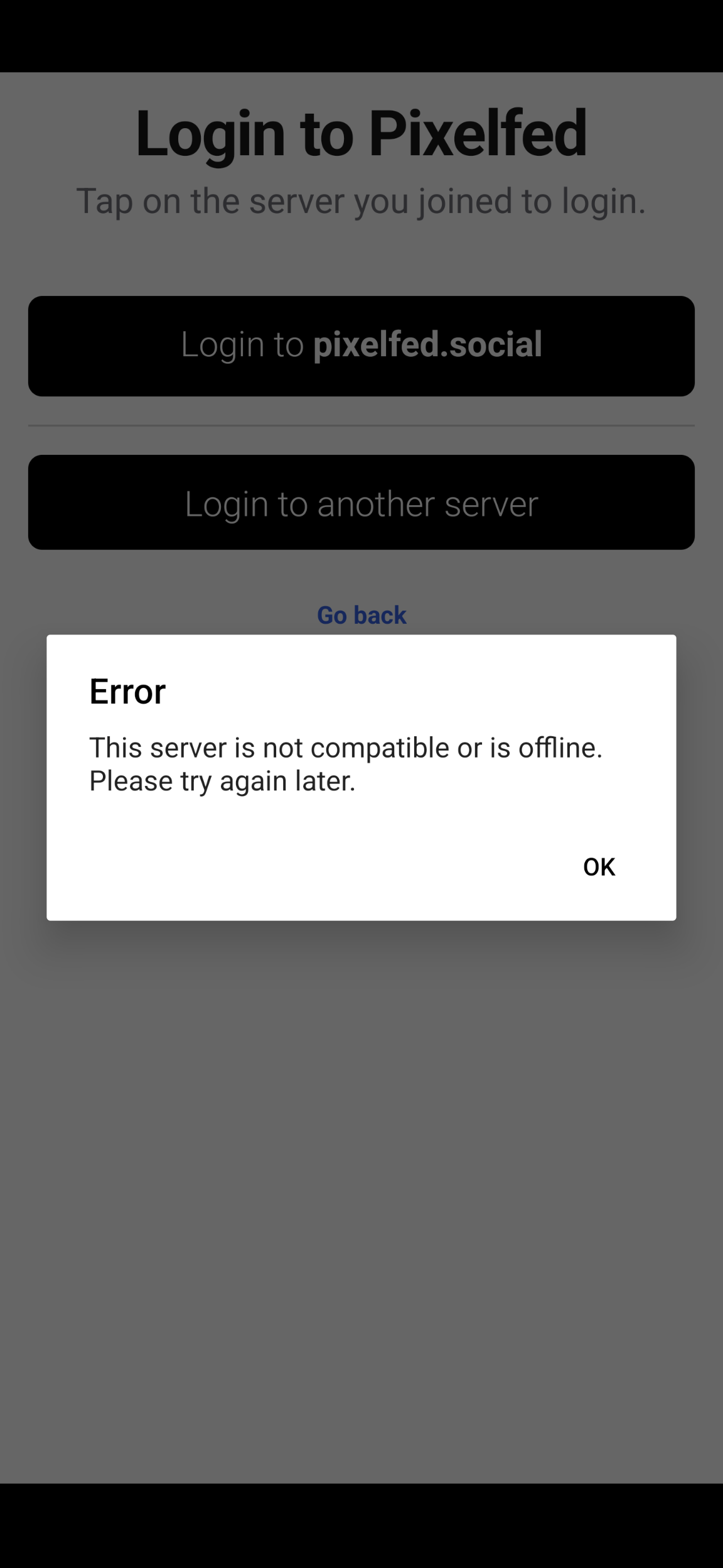
Anyways, when I try to log into the main recommended server (where I already have an account), before I even get to the login page, it gives me this error

Which is a pretty funny thing for the official app to say about the official main instance 🤣
Instead I just installed the PWA from the browser. It works ok.
I just signed up after seeing an article saying links to the website are being blocked by Instagram (IIRC). I figured it must be worth looking into if they’ve gone that far
You have zoomed in. I want to see the y axel from 0. It have increased with 10% of the users.
wow, it’s really cool. I have also made an account on gram.social (pixelfed server). so far I am liking it :)
I tried self hosting Pixelfed but gave up because it wouldn’t work. I’m used to Docker containers that are able to just start up by themselves, but the guide didn’t work for me. Maybe it’s time to try again.
Make sure you use a MariaDB or MySQL database. Despite what the (very incomplete) docu says, Postgres support is broken.
Really? I assumed postgres was the default for basically all open source projects
I’m not sure the graph is accurate.
What are you supposed to put in the “server url” field in Pixelix? I put the instance I have an account on, because I don’t have any other information that would make sense to put there, but nothing happens when I tap the arrow.
Also, what the fuck, fediverse. It’s exactly this kind of bullshit that’s why nobody joins you. Fix it for Christ’s sake. Something this unintuitive doesn’t even belong in a beta build. If I was a paid instagram plant making this app to frustrate people into going back to instagram, this is the splash screen I’d use. Stop making it impossible to recommend you in good faith to people I like.
I don’t know about that app specifically, but I know some fediverse apps do not have all instances in their directory. For example, fedilab doesn’t have friendica.world. I would suggest hunting around for an app that supports your instance, but I agree, it is a dumb problem. What is the point of being able to join whatever instance you want if it is not listed on the app?
deleted by creator
Yes, it’s the most confusing part, if you want to discover Pixelfed accounts from other servers, you have to go to another server’s home page, then click on “Explore” which will show you popular posts by that server’s users. I have done this and now I follow a bunch of accounts from other servers, but the process is very convoluted and the average user would not bother I guess.
The web version of Pixelfed does have a “Global Feed” page but that’s 99% Mastodon posts because the “Global Feed” is actually global relative to the whole Fediverse.
deleted by creator
Yeah, fediverse platforms aren’t going to seriously compete against the big corporate ones until the user experience is as simple.
Exactly. I agree. It needs to be simplified. As easy as creating an account.
Lemmy is unique on the fediverse, in that it has communities that you can subscribe to. The closest equivalent is community groups on Friendica. Pixelfed is more similar to Mastodon in that you can follow individual accounts, or hashtags/search terms, which is how you subscribe to different content in your feed. For example, I follow #catsofmastodon and see all posts tagged with that in my feed. Hashtagging your posts is very important if you want it to be seen. Lemmy is more oriented towards discussions, which is why communities make more sense in this context than on Pixelfed or Mastodon.


